Go City announces new branding and first US ad campaign
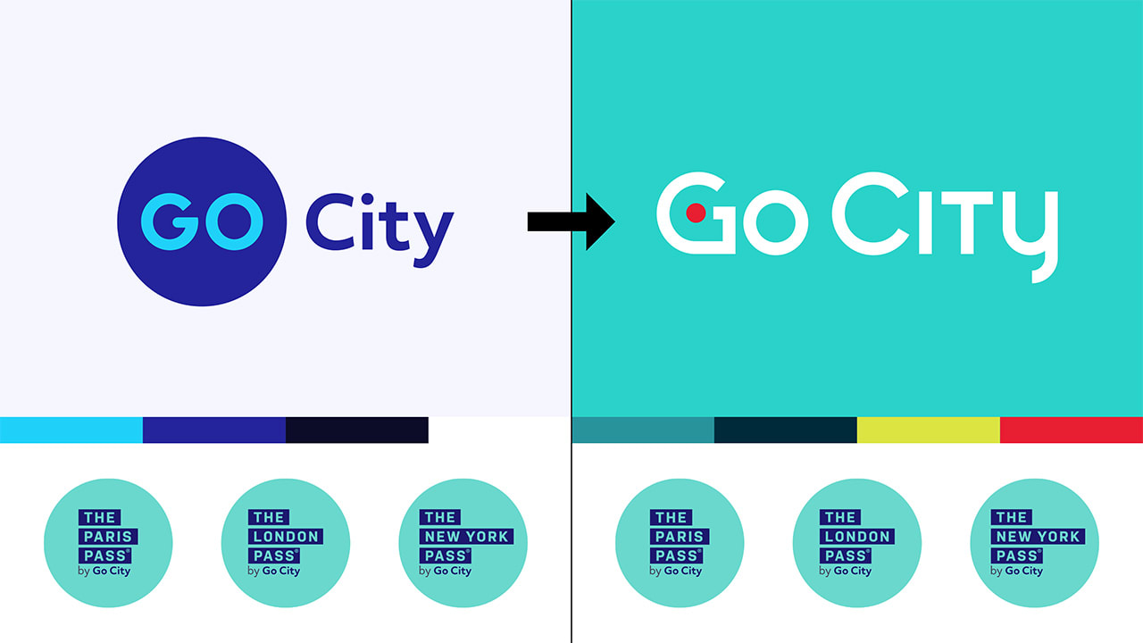
Today, Go City announced an update to its branding in order to help even more travelers around the world have their best city break. The updates to the brand identity better reflect the future growth of the travel company.
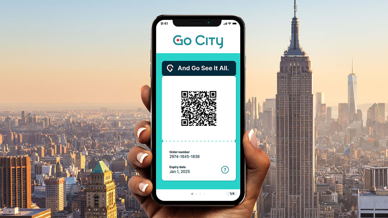
Go City’s famous All-Inclusive passes offer customers the freedom to visit as many attractions in a destination as they like, for one fixed price, delivering incredible savings, choice, inspiration, and ease.

The rebrand includes a new Go City logo and color palette, inspired by ideas of city travel and excitement, and the ambition of Go City customers. The choice of teal as the new primary color reflects their inclination to action, and how they seek to get the most out of their trips. The updated logo immediately signals Go City as a travel technology company, with the app icon bringing the Go City “G” to life as a location pin, reminding travelers of the very best experiences in a city.

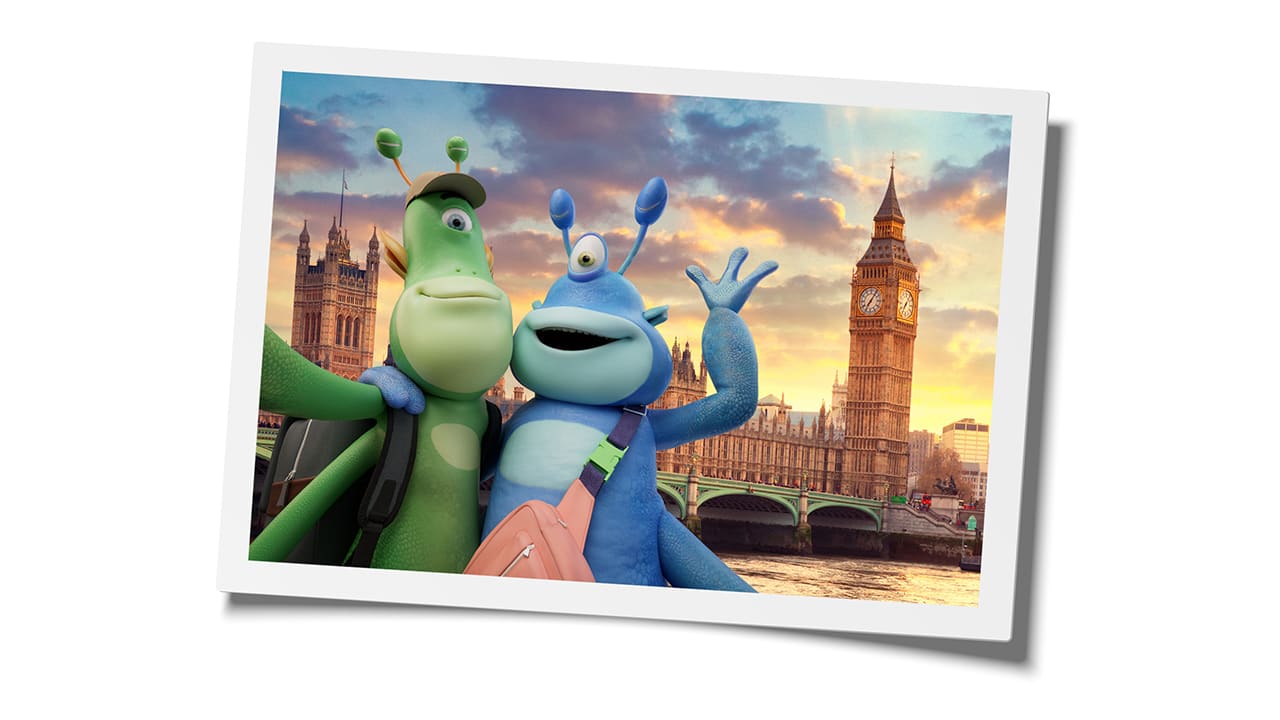
To introduce the new brand to the world, Go City is launching a multifaceted campaign in the US that is centered around two traveling aliens looking to experience Earth’s best cities. As superior life forms, they understand and appreciate the benefits of the Go City product. Jane and Zork save a ton of ‘earth money’ while they explore their bucket list attractions in top destinations such as New York, London and more.

Go City’s All-Inclusive and Explorer passes have helped millions of travelers from around the world save more and experience more on their city trips. The investments in the new brand will enable more travelers to learn about these passes, and help more people have their best city break.
Please join us in welcoming the new Go City: